


Responsive Web Design
"Businesses looking to design a new website this is a must..."
In simple terms, a responsive web design uses "media queries" to figure out what resolution of device it's being served on.
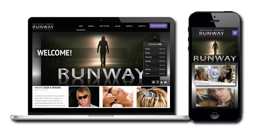
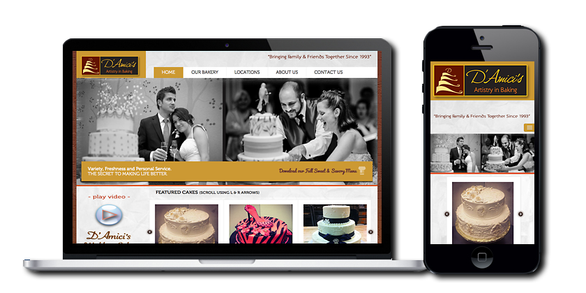
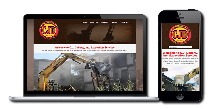
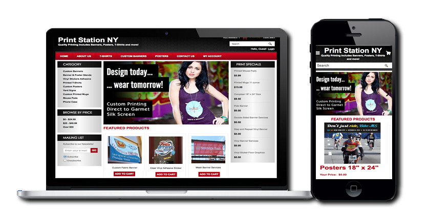
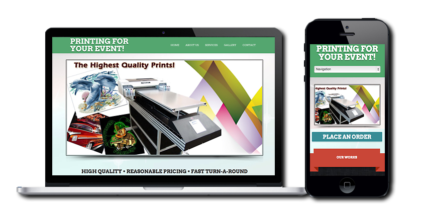
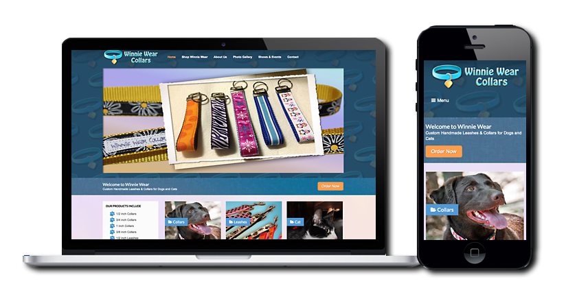
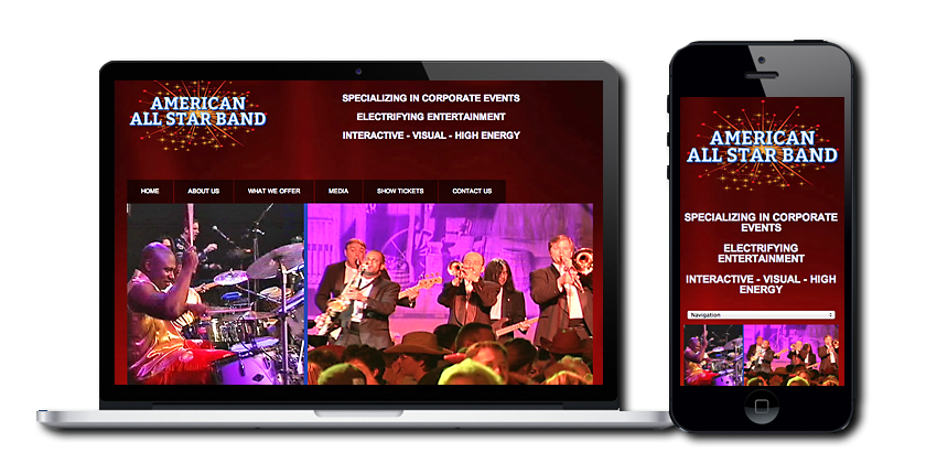
A Responsive Web Site is an approach to web design with a strong emphasis on image viewing experience to make reading easier and minimize resizing, panning, and scrolling for simpler navigation. When viewing the website samples that we designed below try making your browser window smaller from right to left. The images and content column will shrink, then the sidebar will disappear all together.
Additionally, Google prefers responsive web design because content that lives on one website and one URL is much easier for users to share, interact with and link to than content that lives on a separate mobile site.
The benefits are obvious: You build a website once and it works seamlessly across thousands of different screens. Given the rapid adoption of tablets and smartphones — and the fact that users currently seem to prefer finding businesses, restaurants and reading their news on the mobile web rather than in apps — I think it's inevitable that responsive design is taking off.
For business owners, it offers the simplest way to reach customers across multiple devices. For users, it ensures a great experience on every screen. Contact us or call 781.365.4800 for your free consultation.
OUR WEB DESIGNS PROVIDE GREAT RESULTS UTILIZING THE LATEST RESPONSIVE HTML5 TECHNOLOGY. WE ALSO CAN EMBED PLUGINS/FEEDS INTO YOUR WEBSITE FOR ALL YOUR SOCIAL MEDIA.
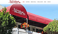
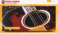
Select any image below to view our Responsive Websites!


Return to Top